Vocation – UI/UX Design & Logo
In this project, I needed to create UI/UX design and a logo for a conceptual vacation house renting business. My duty was to design a “card”, which would represent a vacation house on the homepage of the business. Some type of the elements were given and I was free to add extra. The process included research and analysing statistics for deciding what elements should be present, how to be positioned and how much highlight they should get.
Location
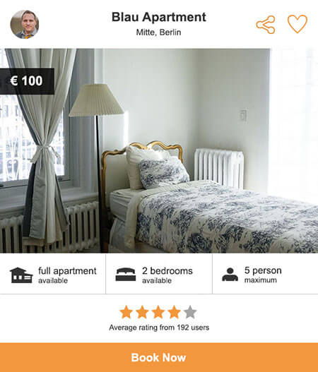
As this screen is placed on the homepage and not a result of a search, showing the location is important. The district name is also shown along with the city to give a better picture about the location
Sharing
The target group is family and students. It’s most likely they travel in group which increase the importance of a sharing function.
Basic Information
The information under the image is the first details people want to know when they are about to book an accommodation according to my research. These are: if the whole apartment can be rented, how many rooms there are, and how many people can be accommodated.
Ratings
The average rating by itself doesn’t say enough information. That’s why the amount of ratings is also shown. It tells about how relevant the rating of the apartment is, and how popular it is compare to others.

Photo Navigation
In this solution a navigation is placed on the photo of the apartment, so the user easily can see other photos without navigating to another page.
Discount
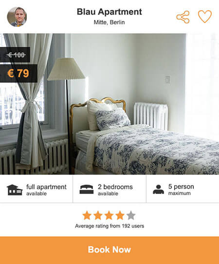
This solution shows how to represent a discount of an apartment. The old price is small, has different color and it is crossed. The discounted price is orange because it represents a new price and it grabs attention.
Expanded Information
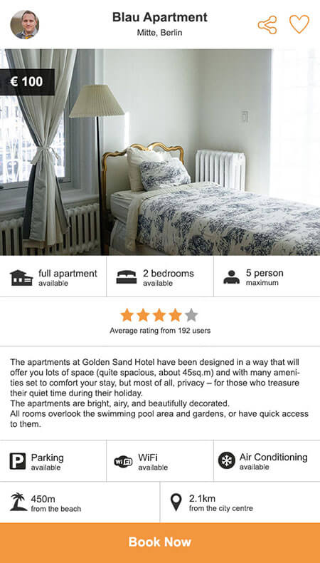
These are extra elements which were left out from the basic version of the design as they are not as important as the other. An idea of expandable “apartment section” was also dropped, as it would rearrange the layout on the homepage when only one apartment card is expanded.
The first row has a general description of the apartment. Text is aligned to the left because it’s easier to read a text which has the same starting point on each row. The second row has basic available facilities (ex.: parking, WiFi, air conditioning). The third row shows distances from specific places (ex.: beach, city centre).

Repositioned Landlord
The image of landlord is repositioned and its name is also added. It gives more focus on the landlord, and creates a better connection. This solution could be applied if the landlord needs focus by the concept.

Information on Photo
In this design solution is either the rating or the landlord, title, and sharing on the screen. It gives more attention to the information which is on the photo, but it crops the picture and makes it less important.
The idea of the final version of the logo was to represent the concept of ‘vacation in an apartment’. It was also a goal to create a logo which is works well on screens, responsive, and can keep up with the future trends. The graphic element is a window with sunlight. The orange represents the sunlight. It is shown only inside the box, showing that the sunlight is outside – placing the viewer in the inside of a vacation apartment. I represent comfort with the typography. The chosen font is comfortable to read through. It has a good flow by keeping the first character lowercase letter and having rounded shape. The Comfortaa font is used by Johan Aakerlund.
Below you can find some earlier versions of the logo.
